Simple and easy to use lightbox with baguetteBox.js
INTRODUCTION
BaguetteBox is an easy to use, simple and great looking free lightbox script. Written in pure JavaScript, no dependencies required, support many advanced features such as multiple-gallery, swipe gesture, responsive and minimal look with image captions support

FEATURES
- Written in pure JavaScript, no dependencies required
- Multiple-gallery support, allows custom options for each
- Supports swipe gestures on touch-screen devices
- Modern and minimal look
- Image captions support
- Responsive images
- CSS3 transitions
- SVG buttons, no extra files to download
- Around 2KB gzipped
INSTALLATION (WITH BOWER)
bower install baguettebox.jsHOW TO USE
1. Include JavaScript & CSS
<link rel='stylesheet' href='https://cdn.rawgit.com/feimosi/baguetteBox.js/v.1.1.1/dist/baguetteBox.min.css'>
<script src='https://cdn.rawgit.com/feimosi/baguetteBox.js/v.1.1.1/dist/baguetteBox.min.js'></script>
2. HTML
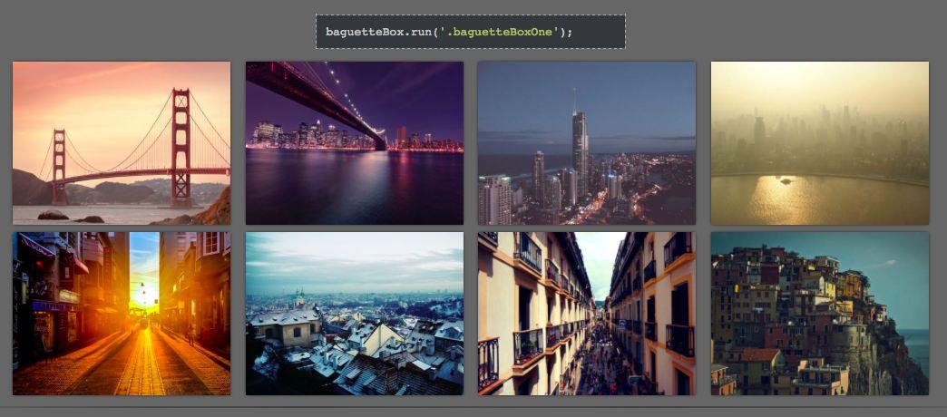
I've taken some photos from the author's websites to make the demo
<div class="gallery">
    <a href="https://feimosi.github.io/baguetteBox.js/img/1-1.jpg" data-caption="Golden Gate Bridge"><img src="https://feimosi.github.io/baguetteBox.js/img/thumbs/1-1.jpg"></a>
    <a href="https://feimosi.github.io/baguetteBox.js/img/1-2.jpg" title="Midnight City"><img src="https://feimosi.github.io/baguetteBox.js/img/thumbs/1-2.jpg"></a>
    <a href="https://feimosi.github.io/baguetteBox.js/img/1-3.jpg"><img src="https://feimosi.github.io/baguetteBox.js/img/thumbs/1-3.jpg"></a>
</div>
We make it look a little bit better with some pieces of CSS
.gallery img {
    height: 100%;
}

.gallery a {
    width: 240px;
    height: 180px;
    display: inline-block;
    overflow: hidden;
    margin: 4px 6px;
    box-shadow: 0 0 4px -1px #000;
}
DEMO
See the Pen baguetteBox.js demo by Thanh Nguyen (@genievn) on CodePen.
OPTIONS
1. Responsive images
To use this feature, simply put data-at-{width} attributes on a tags with value being a path to the desired image. {width} should be the maximum screen width the image can be displayed at. The script chooses the first image with {width} greater than or equal to the current screen width for best user experience.
Here's an example of what the HTML code can look like:
<a href="img/2-1.jpg"
  data-at-450="img/thumbs/2-1.jpg"
  data-at-800="img/small/2-1.jpg"
  data-at-1366="img/medium/2-1.jpg"
  data-at-1920="img/big/2-1.jpg">
    <img src="img/thumbs/2-1.jpg">
</a>
2. Customization
You can pass an object with custom options as a second parameter. The following are available with their corresponding defaults:
{
  captions: true,       // true|false - Display image captions
  buttons: 'auto',      // 'auto'|true|false - Display buttons
  async: false,         // true|false - Load files asynchronously
  preload: 2,           // [number] - How many files should be preloaded from current image
  animation: 'slideIn'  // 'slideIn'|'fadeIn'|false - Animation type
}

