

Circular statistic indicator with Circliful jQuery plugin
INTRODUCTION
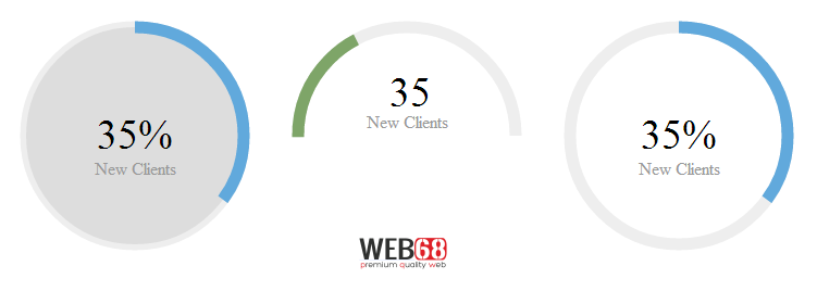
Circliful is a jQuery plugin to show statistics inside cicles , i.e. it uses html5 canvas to show percentage at center and also using circumference. Circulful is very easy to use and there's a lot of optional data-attributes that you can set to make Circliful fits your dashboard
FEATURES
- show Infos as Circle Statistics, no images used
- based on html5 canvas and jquery
- many options can be set as data attributes
- fontawesome integration
HOW TO USE
1. Include circliful CSS & JS along with jQuery
<link rel='stylesheet' href='https://cdn.rawgit.com/pguso/jquery-plugin-circliful/master/css/jquery.circliful.css'>

<script src='//ajax.googleapis.com/ajax/libs/jquery/1.11.0/jquery.min.js'></script>
<script src='https://cdn.rawgit.com/pguso/jquery-plugin-circliful/master/js/jquery.circliful.min.js'></script>
2. HTML structure
<div id="myStathalf" data-dimension="250" data-text="35%" data-info="New Clients" data-width="30" data-fontsize="38" data-percent="35" data-fgcolor="#7ea568" data-bgcolor="#eee" data-type="half" data-fill="#ddd"></div>

<div id="myStat" data-dimension="250" data-text="35%" data-info="New Clients" data-width="30" data-fontsize="38" data-percent="35" data-fgcolor="#61a9dc" data-bgcolor="#eee" data-fill="#ddd"></div>

<div id="myStathalf2" data-dimension="250" data-text="35" data-info="New Clients" data-width="30" data-fontsize="38" data-percent="35" data-fgcolor="#7ea568" data-bgcolor="#eee" data-type="half" data-icon="fa-task"></div>

<div id="myStat2" data-dimension="250" data-text="35%" data-info="New Clients" data-width="30" data-fontsize="38" data-percent="35" data-fgcolor="#61a9dc" data-bgcolor="#eee"></div>

<div id="myStat3" data-startdegree="90" data-dimension="250" data-text="35%" data-info="New Clients" data-width="30" data-fontsize="38" data-percent="35" data-fgcolor="#61a9dc" data-bgcolor="#eee"></div>

<div id="myStat4" data-startdegree="180" data-dimension="250" data-text="35%" data-info="New Clients" data-width="30" data-fontsize="38" data-percent="35" data-fgcolor="#61a9dc" data-bgcolor="#eee"></div>

<div id="myStathalf3" data-startdegree="45" data-dimension="250" data-text="50%" data-info="New Clients" data-width="30" data-fontsize="38" data-percent="50" data-fgcolor="#7ea568" data-bgcolor="#eee" data-type="half" data-fill="#ddd"></div>
3. Initialize Circliful
$( document ).ready(function() {
  $('#myStathalf').circliful();
  $('#myStat').circliful();
  $('#myStathalf2').circliful();
  $('#myStat2').circliful();
  $('#myStat3').circliful();
  $('#myStat4').circliful();
  $('#myStathalf3').circliful();
});
DEMO
See the Pen Circle Progress by Thanh Nguyen (@genievn) on CodePen.
OPTIONS
you can set the options easily as data attributes for Example: data-dimension="250"
- dimension / is the height and width of the element / default is 200px on 200px
- text / will be deisplayed inside of the circle over the info element
- info / will be deisplayed inside of the circle bellow the text element (can be empty if you dont want to show info text)
- width / is the size of circle / default is 15px
- fontsize / is the font size for the text element / default is 15px
- percent / can be 1 to 100
- fgcolor / is the foreground color of the circle / default is #556b2f
- bgcolor / is the background color of the cicle / default is #eee
- fill / is the background color of the whole circle (can be empty if you dont want to set a background to the whole circle)
- type / full or half circle for example data-type="half" if not set the circle will be a full circle / default full circle
- total / If you want to display the percentage of a value for example you have 750MB Ram and at the moment are 350MB in use. You need to set data-total="750" and data-part="350" and the circle will show the percentage value 36,85%
- part
- border / Will change the styling of the circle. The line for showing the percentage value will be displayed inline or outline.
- icon / Fontawesome icon class without the fa- before the class for example not fa-plus just plus
- iconsize / Will set the font size of the icon.
- iconcolor / Will set the font color of the icon.
- animationstep / Will set the animation step, use 0 to disable animation, 0.5 to slow down, 2 to speed up, etc / default is 1
- startdegree / is the degree to start animate fgcolor / default is 0
- bordersize / set the width of the border